How I redesigned the NOTD as a Newbie Web.3.0 Designer.
I’m sharing my journey of how I transformed NFT of the Day (NOTD) homepage into a funky fresh Web3.0 creation as a newcomer designer, the challenges and opportunities I've encountered along the way hoping this could help someone stumble upon a 'Eureka' moment.
Transitioning into the world of Web 3.0 and non-fungible tokens (NFTs) poised to be both exciting and challenging, the rapid evolution of NFT technology and new design considerations that came with it required me to grab a bigger skill set and a more flexible thinking cap.
As I dove headfirst into the wild world of Web 3.0 and NFTs, my first task? Redesigning the NFT of the Day homepage (NOTD), and let me tell you, it was nifty. Hold onto your hats folks because I'm excited to share my wild ride with you!
And thus, my journey began
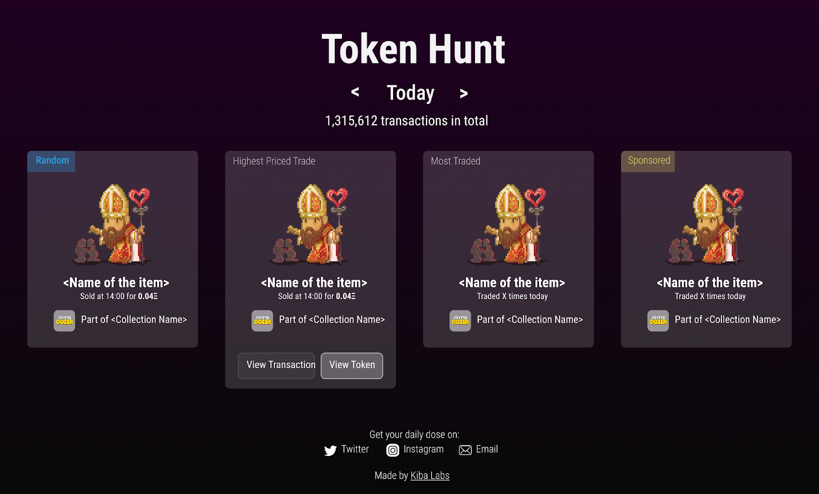
So the NFT of the Day (NOTD) homepage was created to display some cool stats on NFT trading, but as the world of digital art and collectibles grew, the NFT market became too large to visualize. It was like trying to redesign a website on a rollercoaster as I was a newbie, but I stood up to the challenge💪.
My major objective was to update the homepage to highlight more exciting features on a "global level" and to function as a "explorer" for the company's main database, which monitors all NFT collections and single Tokens within a collection, as well as all of their transactions on the Ethereum chain (but who knows, maybe we'll branch out and explore other chains in the future).
Krishan, (co-founder at Tokenpage), sent me a brief with some links to images to inspire me as I got started on redesigning NOTD. It was a great guide as I began my journey to give the site a fresh new look.
The links above are screenshot examples of NFT statistics websites btw.
……And this is what i did next
I began extensive research and education on Web.3 and NFT’s. This required me to study blogs and posts, a few of which are;
-The beginners guide to NFT: What you should know (cryptonews.com)
-How to find NFT Projects (blog.tokenpage.xyz)
-Big questions I have about NFTs(medium.com/@bluepnume)
-What you need to know about NFTs (medium.com/@tfcmariya21)
- All about NFTs in just 3 minutes (medium.com/cryptostars)
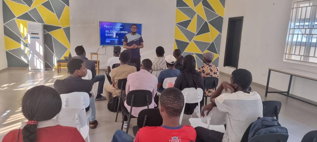
I also attended a blockchain meetup organized by CoLab Kd tagged Blockchain Expo. I chatted with tons of NFT enthusiasts and really got to dive deep into the world of NFTs and the blockchain technology that makes them possible. It was a great experience!
I also put in a good chunk of time researching all the different NFT markets and platforms out there to get a handle on the latest design trends and practices. My goal was to come up with a solution that would make NOTD a top-notch "explorer" for tracking NFT statistics. After all that digging, I've come up with 3 different options for NOTD.
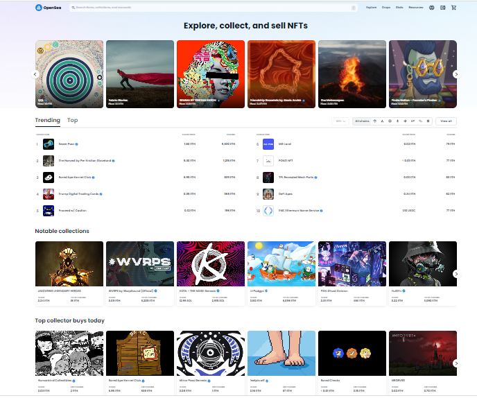
1) The first : The minimalist, grid-based layout with market analysis, which is ideal for users who want a simple and efficient way to browse and discover NFTs without any fuss. It's perfect for a wide range of users, from NFT newbies to experienced collectors and traders who want a streamlined browsing experience.
Think of it as the 'IKEA of NFT browsing', easy to put together and minimalistic. I found some platforms Openseas, looks rare, Rarible, Icy tools that have similar designs and features.
The Pros:
-Simple and easy to use interface, efficient browsing, suitable for all types of users, including those new to the NFT space
-Allows users to easily track their NFT collections, helping users make informed investment decisions, can provide a record of past and current transactions.
The Cons:
-Absence of more immersive and interactive elements that some users prefer.
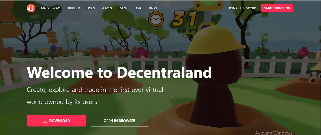
2) The Second option was: An immersive, 3D-based design which is ideal for users who are looking for a more engaging and interactive way to explore and collect NFTs. This option is especially suitable for users who are interested in digital art and gaming, and want to be able to explore and interact with NFTs in a more immersive way. Examples of this include Sorare , Decentraland, Axie Infinity, Splinter lands
The pros:
-Playful and rewarding way to collect and interact with NFTs
Suitable for users who enjoy games and competition.
Cons:
- May not appeal to users who are not interested in the gamification aspect, may not be as suitable for serious collectors and traders.
- Can only provide insights on communities within their ecosystem.
3) The third option was: A dashboard view, which allows users to see the metrics and information that provides a deeper understanding of the market, helping to identify market trends and patterns that are most relevant to them e.g Curio, Magic eden.
Pros:
-Can provide insights on market trends, helping to identify patterns and outliers
-Allow users to customize the data they see, making it easier to track specific NFTs or metrics that are most relevant to their needs.
Cons:
-May not be as accessible for non-technical users, and overwhelming for some users
-Dashboard view NFT explorers rely on data from various sources, which may not always be accurate or up-to-date.
……..I was fired up🔥
Excited about my new discovery I scheduled a call with Krishan, to brief him of my progress so far. I shared all I learned and the ideas I gathered from my research so far. After which he explained how to apply my research to meet the goal of NOTD and appeal to our target users.
During the call it was clear that the first option which was a Minimalisitc grid based layout, aligned more with our goal for NOTD so we opted with art directions and inspirations from platforms which offered such options.
Lastly I pointed out that, unlike conventional web design, there are no predefined protocols or best practices for showing and interacting with NFTs, which poses both a task and an opportunity.
In response Krishan nudged me to play with new and unique ways of showing and interacting with NFTs, and explore multiple possibilities while keeping the user in mind before taking design decisions.
The process
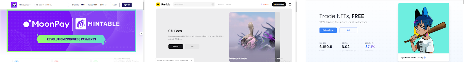
I started by splitting the design of the homepage into sections and researching for art directions which will align with the goals for each section. I decided to have at most 6 sections and at least 3 sections I came across a few other explorers with the same gridlike view such as:
X2y2, Nifty gateway, mintable, Dappradar, Hyperspace, NFTgo, Openseas, Looksrare, Rarible,ICY Tools,coinmarketcap
I analyzed and looked for similar design patterns which were similar to our goals for NOTD Homepage.
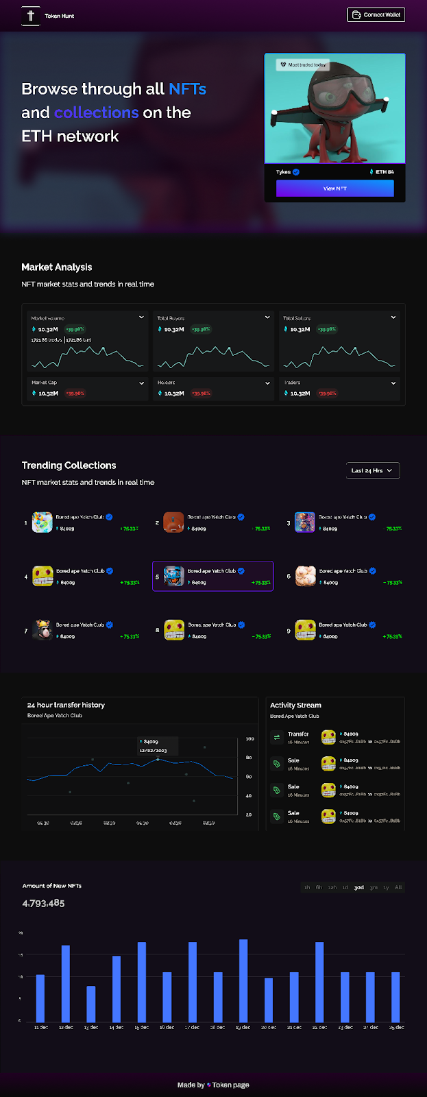
Most had a:
1) Hero section with a catchy micro copy and NFT image.
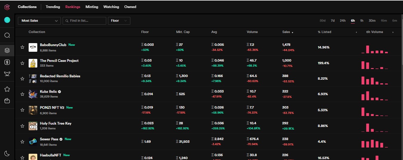
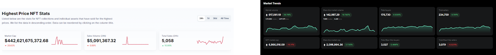
2) Market analysis:
Provides valuable insights into the current state of the NFT market. This section typically includes various graphs and charts that display data such as the total value of NFTs sold, the number of NFTs sold, and the average price of NFTs.
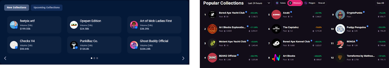
3) Trending Collections Section: Keep users up to date with the top-selling collections.
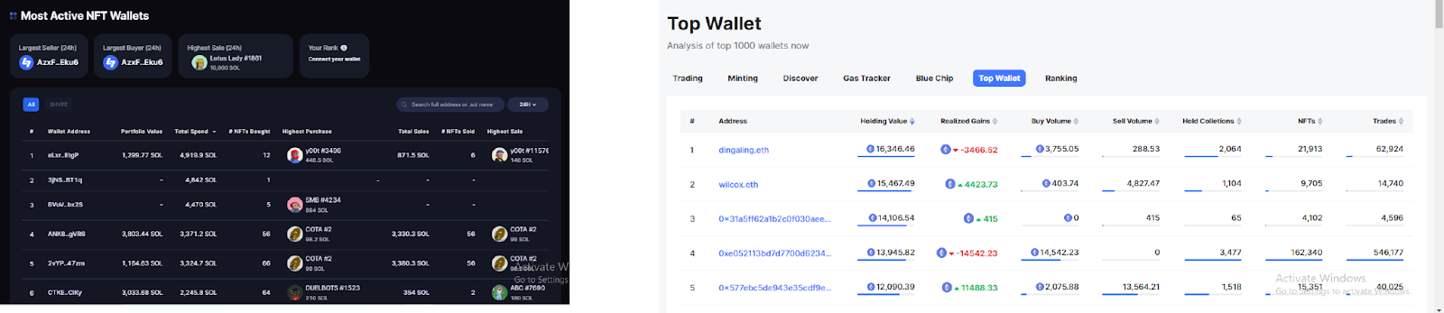
4) Active NFT wallet: Track performance of NFT assets across portfolios on chain and visualize insights
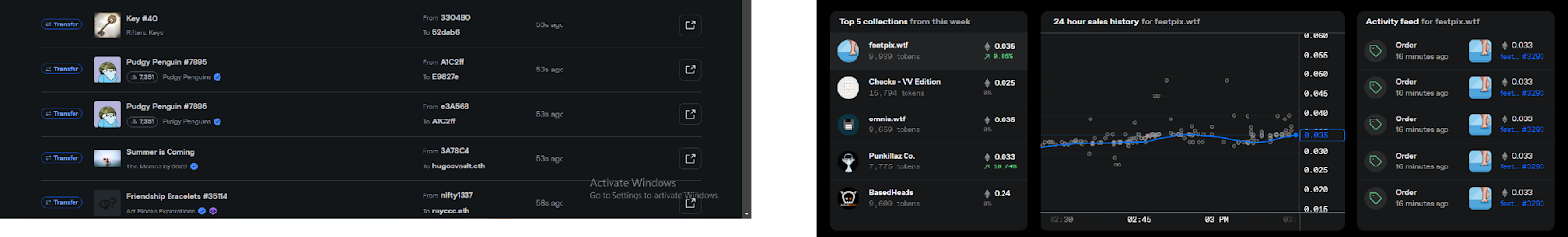
5) Activity Section: Track every transaction on the chain and visualize the insights in real time.
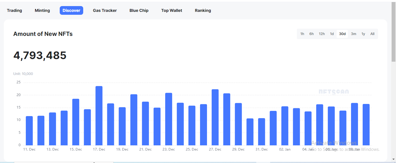
5) Amount of New NFT section: Useful for users to discover newly minted NFTs on the ethereum
6) Recent NFT Listing Section: Give users information about the creator of an NFT, the owner, description, the original minting platform and price
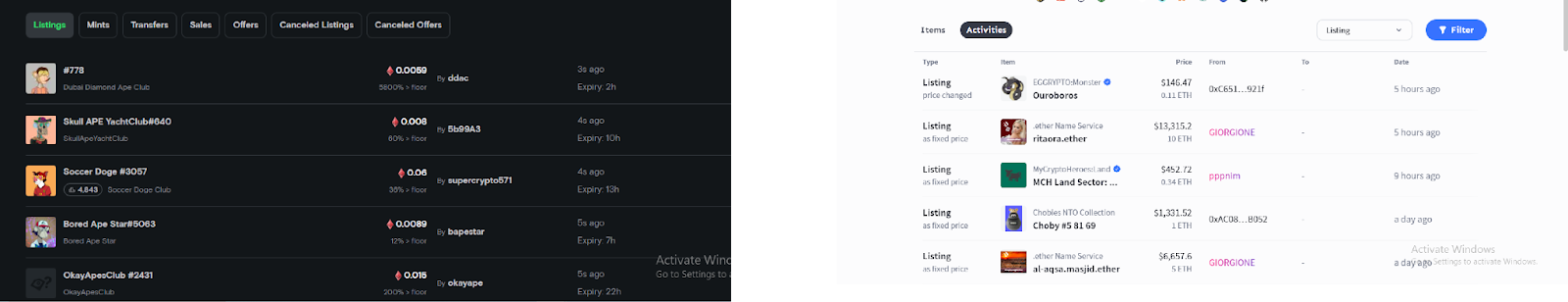
After another call with Krishan we highlighted the pros and cons of each section and we decided not to display the recent NFT listing section because the data wasn’t on-chain therefore won’t prove useful to our target users, who want to keep up with the newest trends and occurrences in the NFT market.
With this information in mind I then put them together to get a feel of the design, and if it will be useful, accessible, and aesthetically appealing, with a focus on clean and organized data to determine trends and assess the performance of the NFTs collectively.
Testing and user input are undoubtedly essential to the redesign process. In the upcoming weeks, we'll release a beta version of the new homepage and ask our users for input to make sure we're on the correct trajectory.
In conclusion, it has been exciting and enlightening to design for Web 3.0 . It's a brand-new and emerging field, and I can't wait to keep exploring the options and pushing the envelope of what is conceivable. One of these is the capacity to produce digital assets that are genuinely original and one-of-a-kind. I'm excited to learn more about the world of NFTs and how to design for it as I continue on this adventure. Keep an eye on this blog and our social media channels for updates on our progress, and as always, thank you for your support and for reading through.